This post is also available in: Italian
 Today I had the opportunity to have early access to the new Adwords interface. I simply received an email from the Google folks with an invitation to see an Alpha version of the upcoming AdWords interface (or “new AdWords experience”, as it seems to be called). Search Engine Land talked about it a couple times, but the final release date is still unclear. I was quite curious, so I checked it immediately.
Most of the features are still turned out/grayed, and unluckily I only managed to join with an old, stalling account that has been basically used as a sandbox. Thus, no conversion data in the view.
Only the Overview tab was active, so actually not much, but still enough to have an impression on the new “Look & Feel” of AdWords Campaigns in the next future. It seems that crucial performance data and KPIs can be easily found in a more visually appalling way, instead of an Excel-like chart (and basically a table row). From my perspective, it looks very promising.
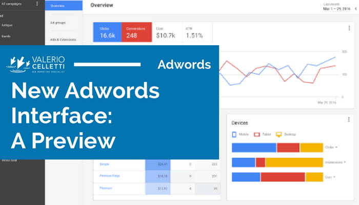
The New Adwords Interface: First Peek
This is the welcome message. Once again, it’s still an Alpha version, as it’s clearly stated.
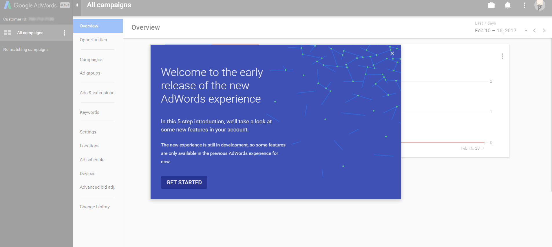
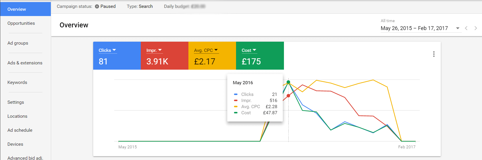
And we are in. The first thing we see is more colors and a bigger, multidimensional chart. Probably the effort has been made in the direction of making performance data more clear.
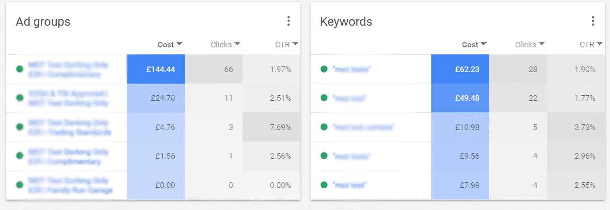
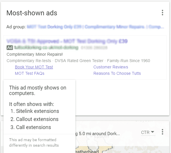
The next widget shows ad group and ads’ costs and CTRs. I really appreciated the visual heat map (colors are different on the base of values).
Another widget. Probably not a ‘key’ information, but nice to have.
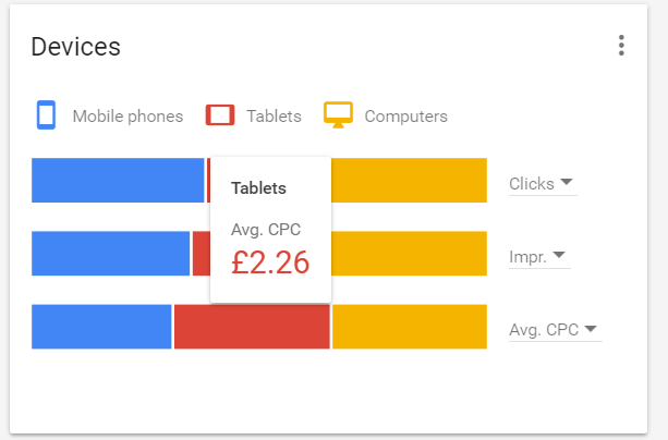
This one is useful. A quick, visually perfect view of different performance data on different devices. On mouse over, the exact value appears.
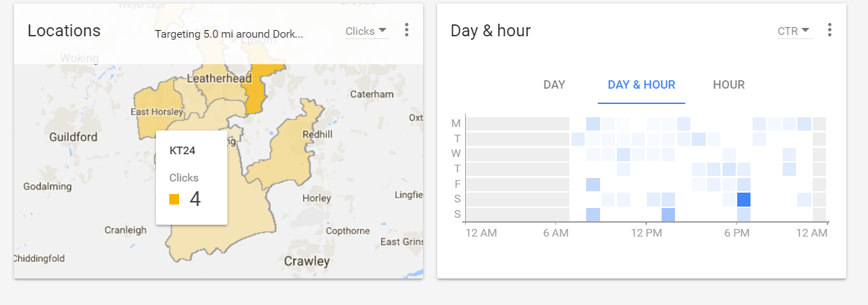
This one is very useful. Performance variations (you can set clicks, CTR, conversions number, conversion rate and so on) in the different targeted areas (this was for a local service, as you can see) and for days of the week, day & hour, and hours of the day. Such information is still not so easy to get on the legacy Adwords interface.
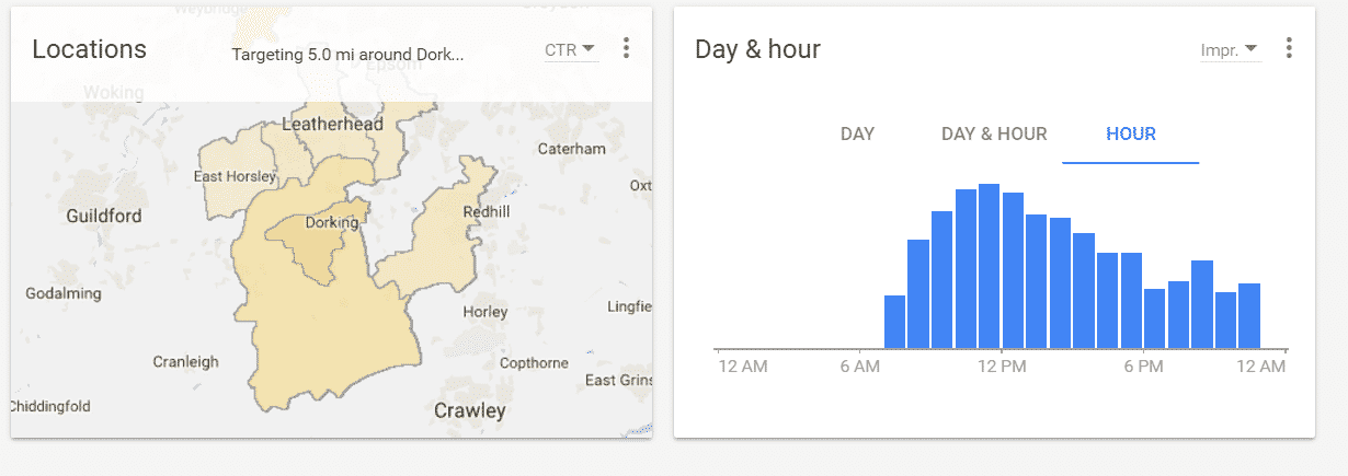
And again, more lovely visual heatmaps. Colors change on the base of values/performance. Same for the day & hour view (darker colors means proportionally higher values).
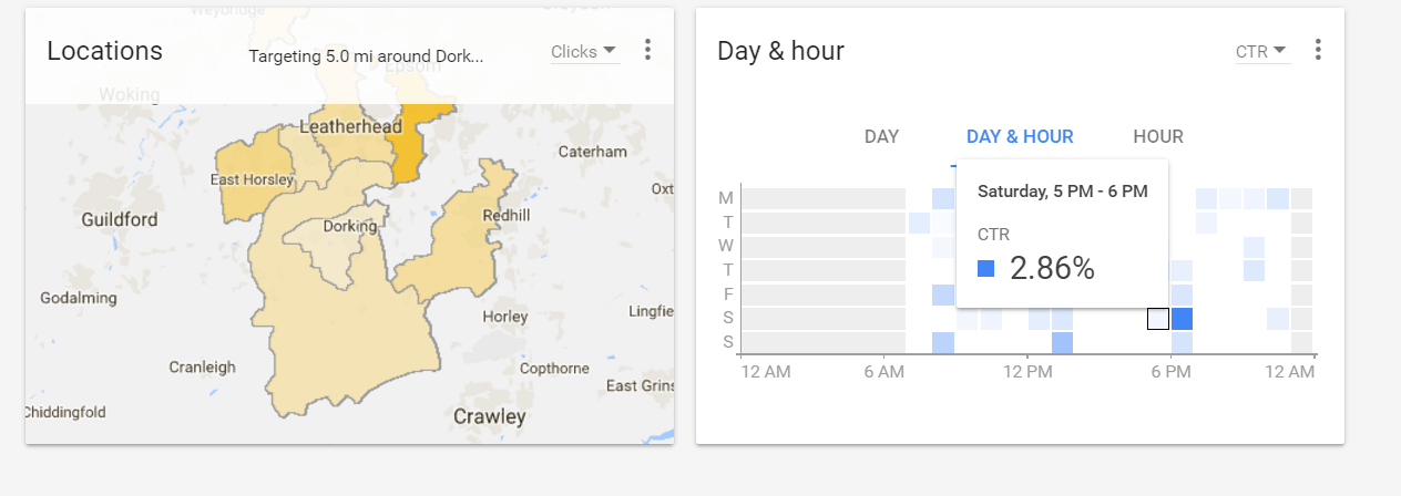 … with a more accurate information on mouse over.
Overall, the new interface seems quite well done, both for account managers (we can have a nice performance dashboard with all the relevant information in a single view) and DIY Adwords advertisers.
Well done, Mr. G. I hope this will be as good as we can expect, and most of all, the mobile app will be as good as the desktop view.
Have you already had a chance to check the new Adwords Interface as well? Comment below with your thoughts!
